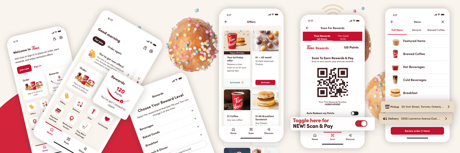
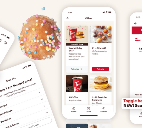
Millions of Canadians use the Tim Hortons app every day to order and pay for their favourite Tims food and beverages, earn and spend Tims Rewards points, and participate in exciting contests like the Tim Hortons NHL Hockey Challenge™.
With that in mind, we’ve redesigned the app’s look and feel and made performance improvements so it’s even easier for you to access all the Tims content you know and love.
Let’s take a closer look at the new design:
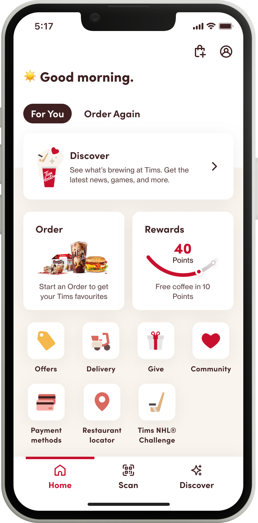
Up first is “For You.” Here you’ll find your weekly offers and discover your soon-to-be favourite Tims products.
Next is “Order Again” – a quicker way to pre-order your most recent purchases.
Then you’ll find larger tiles for every-day actions like “Order” and “Rewards” so you can quickly and easily place your go-to Tims order and stay on top of your Tims Rewards points.
Below those tiles, you’ll find several icons for all your favourite Tims app features including “Offers,” “Delivery,” “Give” for gifting with Tims it Forward and Tim Cards®,” “Community” to connect you with charitable initiatives, “Payment Methods,” “Restaurant Locator” and contest tiles for games like “Tims NHL® Hockey Challenge” or “Roll Up To Win.”
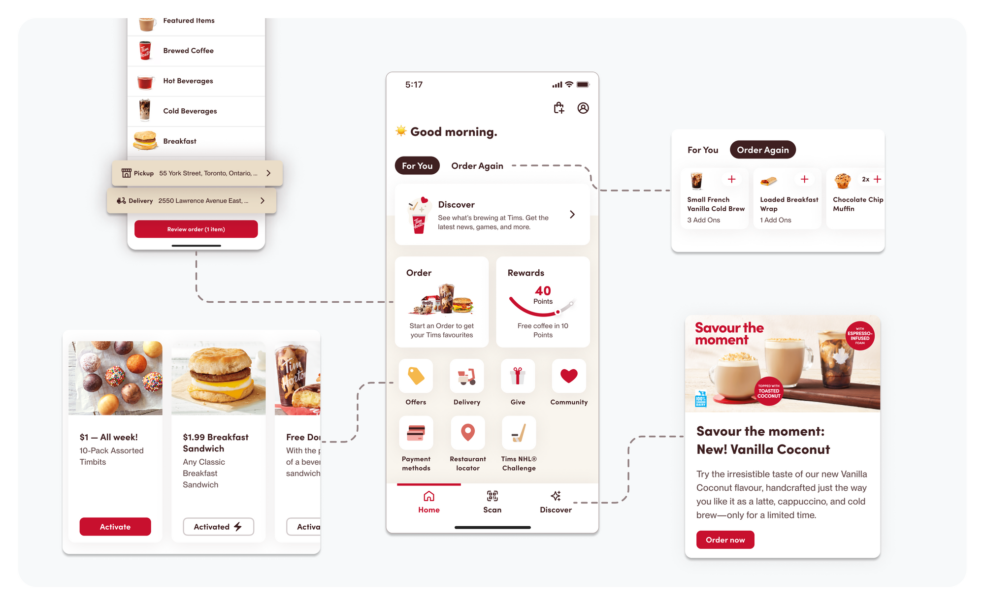
We’ve also included a series of navigation features at the bottom of the app to help you find your way back to the homepage, quickly scan for Tims Rewards, or discover what’s new and exciting at Tims.
“Canadians already love the Tim Hortons app, but we wanted to make it even better by creating a guest-centred digital experience,” says Markus Sturm, Senior Vice President of Digital, Loyalty and Consumer Goods at Tim Hortons.
“We want the app to be a convenient, everyday digital destination for Canadians – just like Tims restaurants are a destination for millions of guests every day. So, we approached the renewed app design in many of the same ways we think about restaurant design, right down to using the same colours you see at your local Tims.”
This version of the Tim Hortons app is available now to guests across Canada.

